Overview
The goal of this project was to design web applications that facilitated and encouraged parents to discuss finances with their pre-teen and teenage children. At the time I started, much of the exploratory research had already been completed. I worked with a team of two other CMU students to refine concepts through iterative sketching and testing, design wireframes, and build an MVP. This project was sponsored by PNC Bank.
Background: Building Prototypes from Previous Research Insights
The client’s goal with this project was to build brand loyalty by creating tools that families can use together to engage with the bank.
When I joined the project, the team had completed the first phase of exploratory research investigating what activities could be used to facilitate conversations between parents and their teenage children about money and borrowing. The team had explored five concepts and found two to be most successful:
1. A loan tool that enabled teenagers to receive loans from their parents. The team had previously tested the concept using a spreadsheet designed to simulate values.
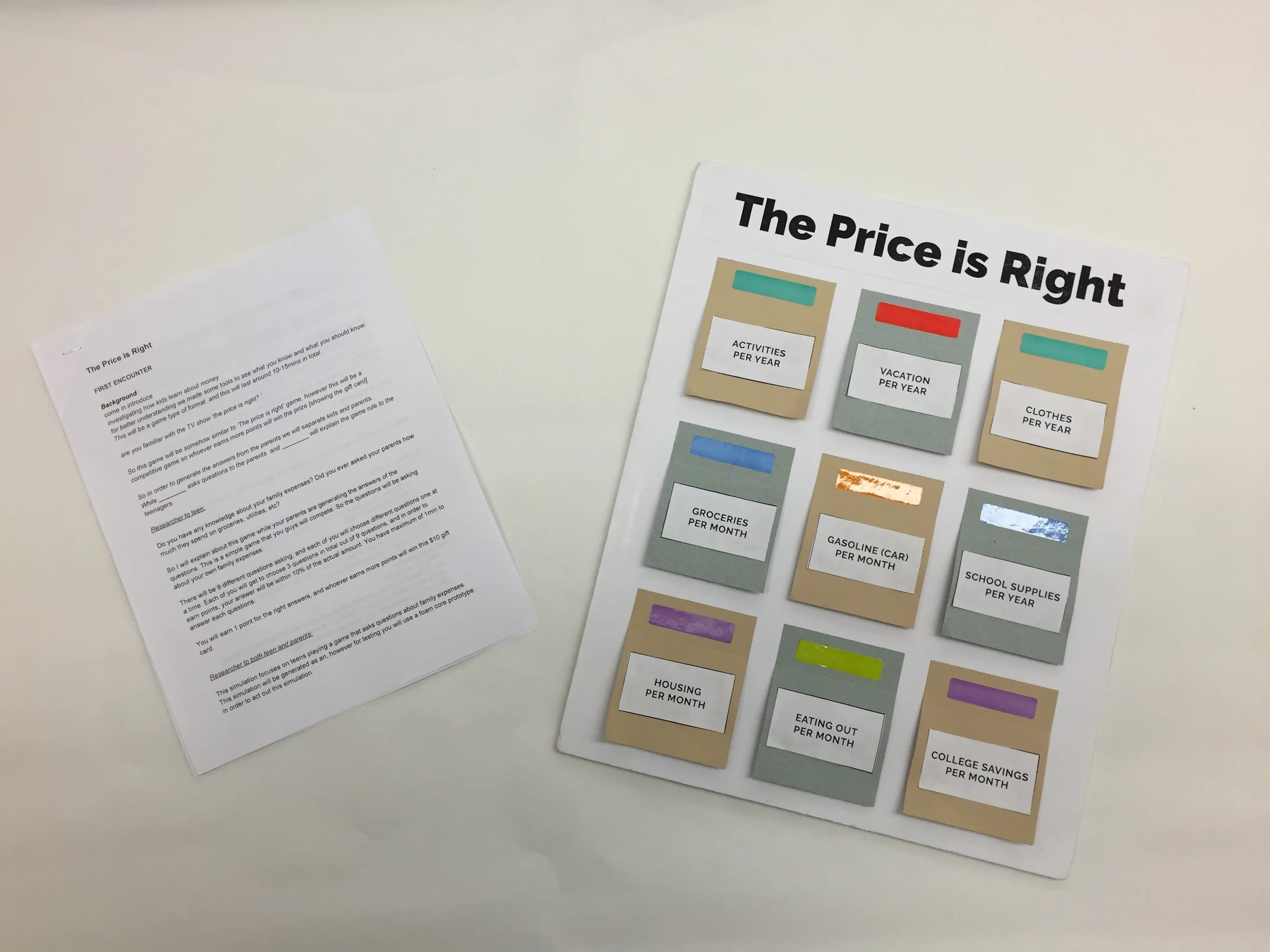
2. A game inspired by the price-is-right for family budget items. The team had previously tested the concept with a poster board version of the game.
The team had performed user enactments with these two concepts using a paper prototype for the game and an spreadsheet for the loan tool. The goal going forward was to take these two concepts and create a minimally viable product that could be tested with families in Pittsburgh.
Loan Tool: White-Boarding Initial Ideas
To begin, we discussed what core functionality would need to be included in our prototype. With the core functionality in mind, we sketched wireframes as a team that were later converted into digital wireframes.
Wireframes
Using Sketch, we created wireframes to describes the UI and specify the flow of the loan tool application. With this approach, we envisioned a series of accordion panels that allowed the parent and child to step through the process of getting a loan. The advantage of this flow was that it allowed the user to see exactly where they were in the process of getting a loan and easily step back if necessary.
Testing with Users
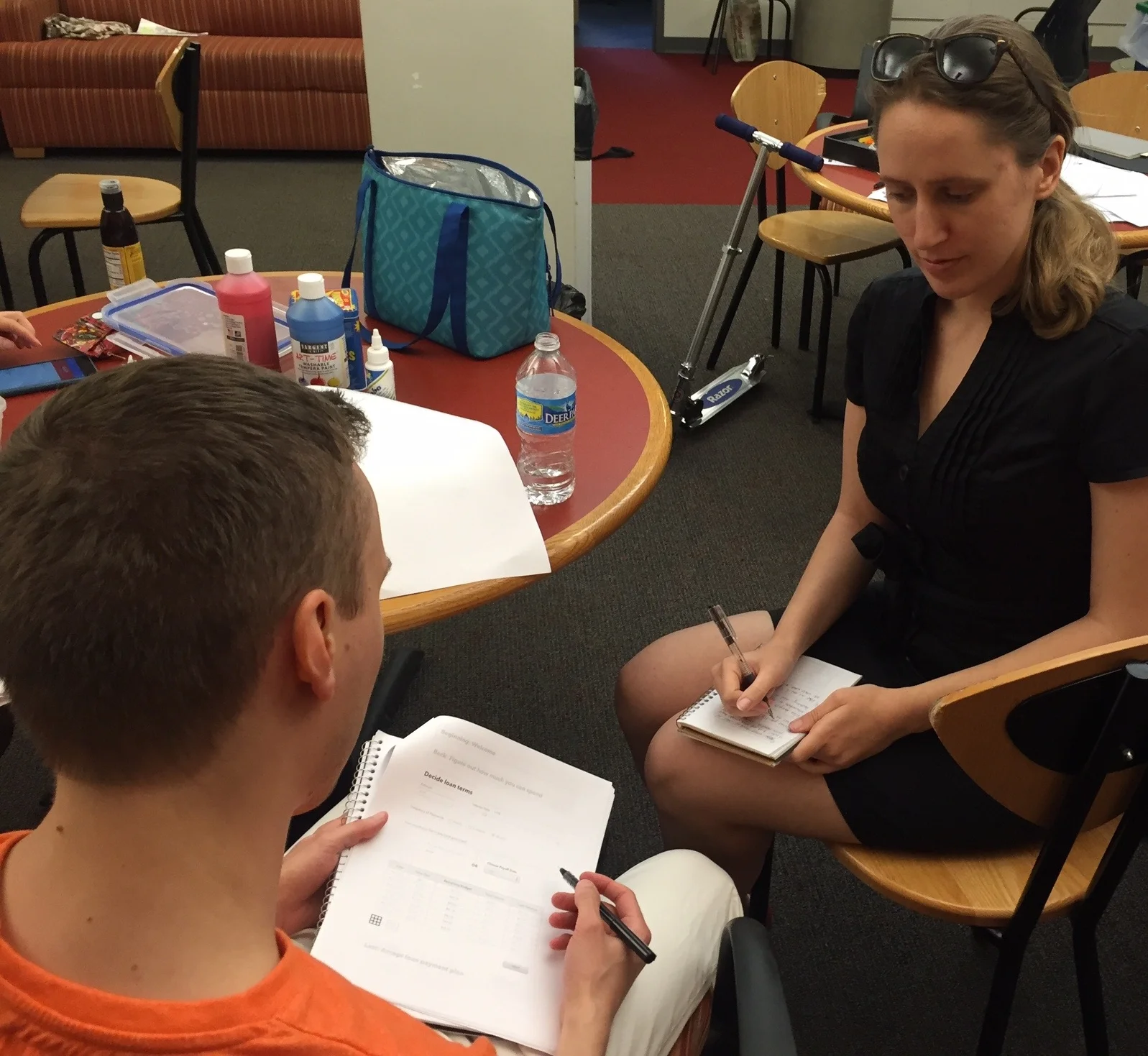
We tested our wireframes with users in their late teens to understand:
Can users follow the options and flow we created in the wireframes?
Could teenage users see themselves using this tool with their parents?
Testing revealed that users did not have difficulty using the application. However, there were steps involved in making a loan that weren't core to the functionality which we decided to remove after these tests.
Pivot: Simplifying the Flow
Based on feedback from our team advisors and testing, we took a step back from the first set wireframes which were a series of detailed accordion forms. We shifted toward a streamlined version that boiled down the prototype to only the most essential features. These four sketches guided our new direction.
Wireframes Revisited
From the sketches, we updated the wireframes to reflect the pared down version of the loan tool. There were five key screens, each of which had several states.
High Fidelity Mock-Ups
After reaching further consensus among the team with the wireframes, high fidelity UI skins were created using Sketch. Additional support text was also added.
Implementation: Harnessing Django and Custom CSS
To implement the application, we used the Django framework and styled the pages using CSS. I worked primarily on the front-end while a teammate handled the backend portion.
Minimally Viable Prototype Render
With the MVP implemented, we plan to test the loan tool with parents and their kids in Pittsburgh during June and July of 2016. Stay tuned for updates!
Render of final screen.
Budget Game
Sparking Moments of Teaching Between Parents and Their Kids
The Budget Game took a different approach to encouraging financial conversations between parents and their kids. The core concept was for kids to guess the cost of various expenses their parents pay on a regular basis (e.g. car payment, mortgage, utilities). The idea leveraged the fun and delight of a game for encouraging open discussions about finances and the real situations families were faced with.
Sketching Initial Ideas
Initially, we sketched a flow for the game that closely reflected the paper prototype. We designed the initial game to take place on one screen.
After presenting this flow to the team's advisors, we discussed making several key changes:
Shift to 2-screen version. As a team, we decided to move to a version that would take place on two mobile screens rather than one laptop screen. The idea was that though the parent and child would likely be playing in the same location, two screens would better facilitate the parent entering information without the child seeing it.
Rework parental input of costs. We decided to rework the flow of the game so that the parent doesn't have to pre-enter all costs. Instead, The parent will enter each cost before the child guesses.
Increase fun in guessing. We aimed to engage the child by making the act of guessing itself more delightful and rewarding.
Testing Paper Prototypes
Using paper prototypes, we explored ideas to make guessing expenses more delightful and more challenging. We took inspiration from existing games and the previously conducted user enactments.
From play testing, we had several key findings:
Single guess games were preferred. Players preferred games that involved guessing one item over games that involved ranking multiple items.
Kids care more about winning. It is more important for the guesser (the child) to obtain a sense of victory then the price provider (the parent).
Certain costs were off limits. This varied from between participants but costs closely linked to income level were avoided more often.
White-boarding Flows
For two games that were successfully play tested, we created flows for both the parent's screen and the child's screen.
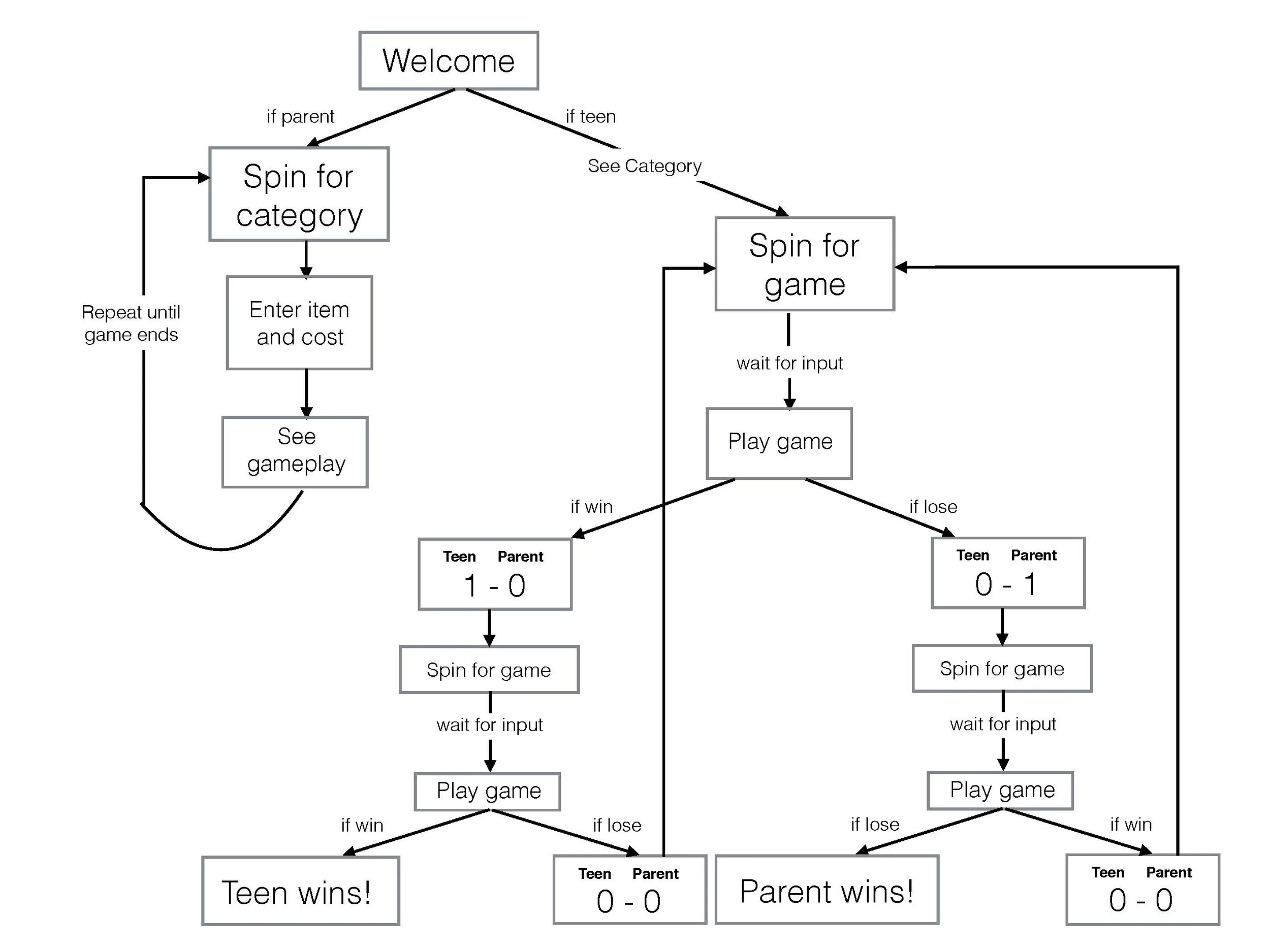
A flow chart for the entire game was also created to document:
Mini-Game Selection
Cost Input
Score Keeping
Interface Sketch for 5 Games
Our team chose five mini-game concepts encapsulated in an overall game this minimally viable prototype. We sketched play testable screens for the landing screen and mini-game screens.
Wireframes
We created digital wireframes using Adobe Illustrator.
Final Interface
Finally, after consensus was reached with digital wireframes, we created high-fidelity mock ups of the interface.


